Fountain pen nibs explained: parts, sizes, materials, grinds, and how to pick yours
The nib is the metal writing point at the tip of every fountain pen. It is a small, split wedge of shaped metal, and almost every question beginners have about writing feel, line width, scratchiness, or ink flow traces back to it. Get the nib right and a pen feels effortless. Get it wrong and nothing about the pen will satisfy you.
This guide covers everything in one place: what a nib is made of, how its parts work together, which sizes do what, the difference between gold and steel, how grinds change the writing character, and the vocabulary hobbyists use to describe feel. It ends with a decision chart so you can match a nib to the way you actually write.
The parts of a nib and what each one does
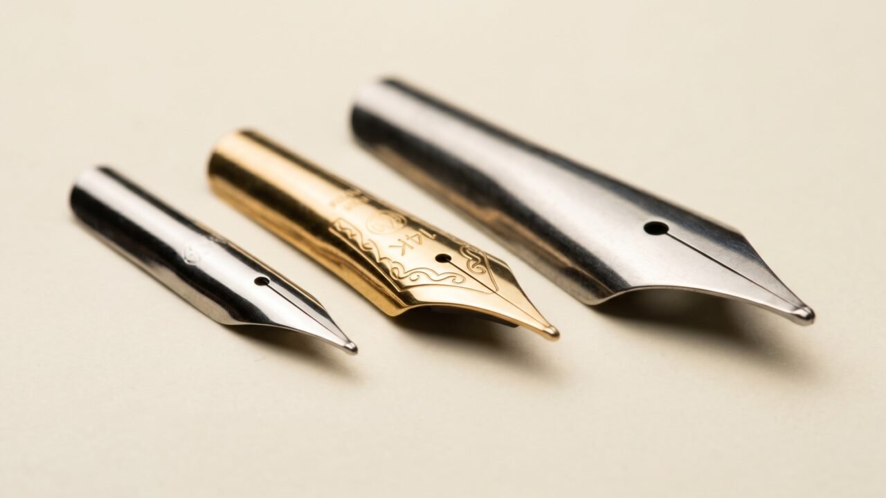
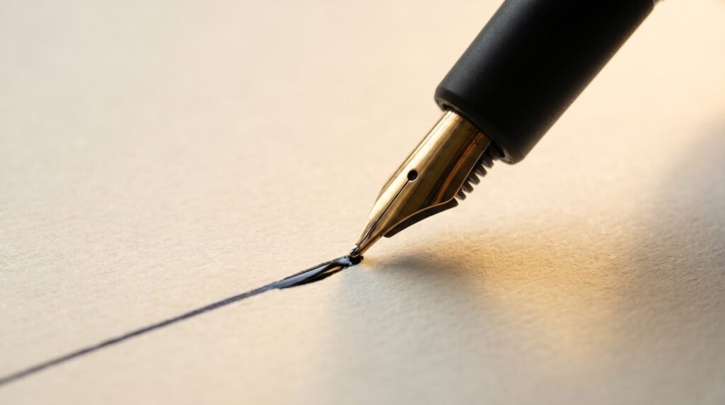
A modern fountain pen nib is a single stamped piece of metal, roughly the shape of an elongated teardrop, with a few precise features cut or polished into it.
The tines are the two arms that extend from the body of the nib toward the writing point. A thin cut runs between them from tip to breather hole. That cut is the slit, and it is how ink travels to the page: surface tension holds a column of ink in the channel, and when the tines touch paper, the ink flows down and onto the surface by capillary action. The tines flex very slightly as you write and spring back together when you lift the pen.
The breather hole sits roughly in the middle of the nib where the slit widens into a small opening. It serves two purposes. First, it regulates the exchange of ink flowing out and air flowing in, keeping ink supply steady. Second, it relieves mechanical stress at the top of the slit so the nib does not crack under the tiny flexing that happens thousands of times across a writing session. Breather holes range from simple round punches to heart-shaped and teardrop designs; a larger or more flexible hole shape can make the nib slightly more responsive to pressure.
At the very tip, a tiny ball of extremely hard alloy is welded on. This is the tipping material. It is what actually touches the paper, and because paper is abrasive, the tip would wear out quickly without it. Marketing copy often calls this ball “iridium,” a name that dates to the early 20th century when platinum-group metals were standard. Wikipedia’s entry on pen nibs notes that modern tipping uses a range of platinum-group metals, including osmium, rhenium, and ruthenium, alongside tungsten, and that pure iridium has not been commonly used since the mid-1950s. Whatever the alloy, the tipping ball is ground and polished to the shape that determines the width and character of the line you lay down.
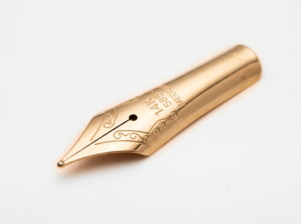
The body of the nib above the tines provides rigidity and is where the maker stamps their logo, metal purity markings such as 14K or 18K, and sometimes the nib size designation.
Underneath the nib, pressed against it, sits the feed (a separate piece, not part of the nib itself). Its channels carry ink forward and let air back into the reservoir in exchange. The nib and feed work as a matched pair.
Nib sizes: what EF through BB actually mean
Nib size refers to the width of the line the tipping deposits on paper. There is no universal millimeter standard across makers, but the letter grades below give a reliable working guide.
| Size | Designation | Approx. line width (Western) | Best for |
|---|---|---|---|
| EF | Extra fine | ~0.3-0.4 mm | Very small handwriting, cheap copy paper, dense note-taking |
| F | Fine | ~0.4-0.5 mm | Small-to-medium writing, everyday notebooks, crisp lines |
| M | Medium | ~0.5-0.6 mm | Average handwriting, general journaling, first fountain pen |
| B | Broad | ~0.7-0.8 mm | Large handwriting, signatures, wet inks that shade or sheen |
| BB | Double broad | ~1.0 mm+ | Calligraphy headers, dramatic signatures |
A few brands add intermediate grades. Pilot, for instance, offers SF (soft fine), FM (fine-medium), and SFM on many of its Custom-series pens, giving 16 distinct nib choices on the Custom 742. LAMY offers a left-hand (LH) nib and a beginner (A) nib alongside the standard widths. Platinum’s 3776 Century goes as narrow as UEF (ultra extra fine), one step finer than EF, and as broad as a double broad.
One rule every beginner should know before buying: Japanese nibs run about one full size finer than equivalent Western nibs. A Japanese medium from Pilot, Sailor, or Platinum will lay down a line closer in width to a fine from Lamy or Pelikan. The difference comes from writing traditions: Japanese scripts demand finer detail. If you order a medium from a Japanese brand and expect a European medium, you will be surprised. Our guide to Japanese vs Western nib sizes has the full conversion chart.
Nib materials: steel, 14K, 18K, and 21K gold
Fountain pen nibs are made from one of two base metals: stainless steel or a gold alloy. The choice affects how the nib feels underhand, how it ages, and what it costs.
Stainless steel nibs
The most common nib material in fountain pens is austenitic stainless steel, typically the grade designated 316L. By composition it is roughly 65-70% iron with 16-18% chromium, 10-14% nickel, and 2-3% molybdenum. This alloy resists corrosion from modern water-based fountain pen inks, and it can be work-hardened to high rigidity.
Steel nibs are firm, predictable, and durable. Kaweco states that its nibs are made in Germany by nib specialist Bock; LAMY’s Z50 steel unit is interchangeable across nearly every pen in its range. Steel nibs on well-made pens can be polished to excellent smoothness, because smoothness depends far more on the shape and finish of the tipping ball than on whether the body underneath is steel or gold. A properly tuned steel nib on a TWSBI ECO or a Pilot Metropolitan can write as pleasantly as a mid-grade gold nib on a pen that shipped slightly misaligned from the factory.
Gold nibs
Gold nibs are alloyed with other metals because pure gold is too soft to hold a shape. The karat number tells you how much gold is in the mix.
- 14K gold is 58.5% pure gold. It is stiffer and more durable than higher-karat options, and many hobbyists prefer it for everyday writing because the slightly higher spring-back keeps the nib from deforming under modest pressure.
- 18K gold is 75% pure gold. The greater gold content makes it marginally softer, producing a mild cushioned sensation that writers describe as “bounce.” Pelikan uses 18K on its M800 and M1000 series.
- 21K gold is 87.5% pure gold. Sailor uses it as the standard material across its 1911 Large and Professional Gear lines, an unusual choice that gives the nib a refined responsiveness while staying remarkably controlled. Sailor does not use this high karat to create flex; the goal is a nib that absorbs micro-vibration while maintaining precise line width.
One persistent myth is that gold nibs are inherently smoother than steel. Bottle and Plume’s technical article on nib materials puts it plainly: smoothness is primarily a function of the tipping geometry and polish, not the base metal. Both steel and gold nibs use similar hard tipping alloys. A well-made steel nib beats a poorly tuned gold one every time.
What gold does offer is a distinct character under pressure. The alloy’s greater malleability lets the tines spread a fraction when you press harder, then return cleanly when you ease up. The degree of this spring depends on nib thickness, tine length, breather hole shape, and alloy composition. Some writers feel no difference. Others find the feedback from a gold nib difficult to give up once they have experienced it.
For a deeper comparison of when the upgrade makes sense, see our article on gold nib vs steel nib.
Nib grinds: how the tip shape changes the writing character
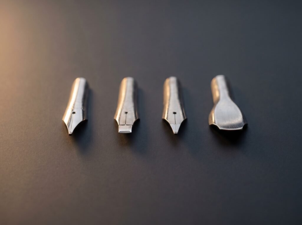
Most nibs ship with a round tip that lays down a consistent width in every direction. This is the standard round point, and it suits most writing tasks. But a nib’s tip can be shaped differently, and each shape changes how the line looks and how the pen moves across paper.
Stub
A stub nib has a flat, rectangular tipping ball with rounded corners. Pull the pen downward and you get a broad stroke; push across on a crossbar and you get a narrower one. The difference is subtle rather than dramatic. Stubs are forgiving and easy to write with, and they add a modest calligraphic character to everyday handwriting without requiring any special technique. TWSBI includes a 1.1 mm stub in its ECO range. Kaweco offers calligraphy nibs from 1.1 to 2.3 mm.
Italic
An italic nib has sharper corners on its flat tip, producing more pronounced thick-thin transitions. Downstrokes are distinctly broader; crossbars are distinctly narrower. The sharpness that creates the dramatic line variation also means the nib catches more on paper texture, so italic nibs reward a consistent pen angle and a smooth surface.
Cursive italic
A cursive italic sits between stub and italic in both sharpness and writing behavior. The corners are crisp enough to add character but rounded enough that casual handwriting does not suffer. Most nibmeisters describe it as the most practical specialty grind for daily use.
Architect grind
An architect grind is a stub rotated 90 degrees. The flat edge runs across the tine direction rather than along it, making horizontal strokes broad and downstrokes fine. The effect is the reverse of a standard stub or italic: thin letters, wide cross-strokes. Writers who find standard stubs too uniform sometimes prefer an architect for a different kind of line interest.
Flex nibs
A flex nib is designed to spread its tines significantly under added pressure, producing a wider line on downstrokes and returning to a narrow line when pressure lifts. Wikipedia’s article on flex nibs notes they were prevalent before the 1930s, when broad, pressure-responsive flex was common in Waterman and Montblanc production. No current manufacturer produces nibs with the full flexibility of vintage “wet noodle” examples from that era.
Modern pens marketed as flex, such as Pilot’s Falcon (described as semi-flex), offer moderate line variation. Pressing too hard will permanently spring the tines open, a deformation that often cannot be fully corrected even by a nibmeister. If true vintage flex is your goal, our article on flex nibs explained covers the difference honestly.
For the full range of specialty grinds and what a professional adjustment involves, see our guide to architect, cursive italic, oblique, and fude grinds.
The feel vocabulary: wet, dry, toothy, buttery, springy
Fountain pen hobbyists use a specific set of words to describe writing feel. Learning them before you buy saves confusion.
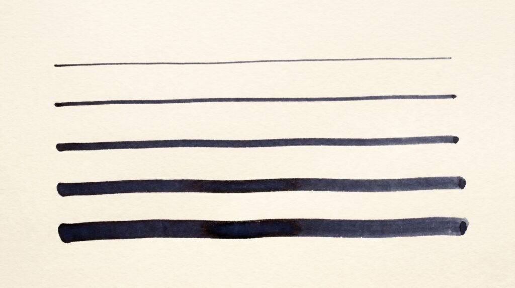
Wet and dry refer to how much ink the pen lays down, not to the ink’s formula. A wet nib delivers a heavy flow. Lines look saturated, shading is more vivid, and the pen glides easily. A dry nib deposits less ink per stroke, producing crisper edges and drying faster on the page. Neither is broken. Japanese nibs trend toward the drier end of the spectrum; German nibs (Lamy, Pelikan) trend wetter. This directly affects pairing: a wet nib with a heavily saturated ink can feather on absorbent paper, while a dry nib with a very dry ink may skip. Our article on the wet nib and dry ink pairing rule explains the fix.
Smooth and toothy describe physical feedback. A smooth nib glides with almost no sensation. A toothy nib has texture: you feel the paper surface beneath the tip, like graphite on good paper. Many writers prefer some tooth because it gives a sense of where the nib is on the page. Toothy is desirable; scratchy is a defect. A scratchy nib catches and snags rather than gliding with feedback. Scratchiness often signals misaligned tines, a bent tip, or a tipping ball that is not fully polished. Gentle micromesh smoothing can help mild cases; anything beyond that belongs with a nibmeister.
Springy describes the cushioned give of a soft nib under the hand. The tines flex slightly, absorb pressure, and return. It is not flex writing (no visible line variation) but it feels alive in a way a rigid nib does not. Pilot’s soft-nib designations (SM, SFM, etc.) deliver this quality. Sailor’s 21K nibs, despite using a higher-karat (and metallurgically softer) gold, are tuned for controlled precision rather than pronounced spring: the goal is a nib that absorbs micro-vibration while holding an exact line width, not one that bounces noticeably under the hand.
Buttery simply means very smooth with a warm, slightly cushioned sensation, the combination of minimal feedback and soft spring that describes a well-tuned gold nib on good paper.
The nib-decision flow: matching a nib to your writing
Use the table below to narrow your choice before you buy. Each path leads to a concrete recommendation rather than a vague range.
| Your situation | What matters most | Recommended starting point |
|---|---|---|
| Complete beginner, everyday notebooks | Reliable flow, forgiving | Medium round, steel, from a Western brand (Lamy, TWSBI, Kaweco) |
| Small, tight handwriting | Crisp narrow line | Fine or EF from a Western brand; or Medium from a Japanese brand |
| Writing on cheap copy paper | Minimal feathering and bleed | Fine or EF; drier Japanese nib preferred |
| Want ink shading and sheen to show | Generous ink flow, broad line | Broad or double broad; wet German nib; good paper required |
| Want calligraphic line variation without lessons | Thick-thin difference in normal writing | Stub 1.1 mm (easy) or cursive italic (more expressive) |
| Left-handed, overwriter position | Fast dry, no smudge | Fine or EF with a fast-drying ink; LAMY LH nib is worth trying |
| Daily writer who wants to upgrade feel | Softness, spring | 14K or 18K gold, medium; try Pilot or Pelikan as a first gold nib |
| Writing Japanese or Asian scripts | Very fine lines, precise | EF or F from Pilot, Sailor, or Platinum; no Western broad-nib habits |
| Calligraphy or serious line variation | True flex or sharp italic | Pilot Falcon (semi-flex) or dedicated italic; read the flex guide first |
A few practical rules that belong in every nib guide
These are the safety and care facts that trip up beginners most often.
Flush a new pen before first use. Factory assembly leaves light oil residue in the feed and section. That residue causes hard starts on the first fill. Flushing the pen with cool water before inking it removes the oil and takes about two minutes. This applies to every new pen, regardless of price.
Write with almost no pressure. A fountain pen is not a ballpoint. The ink flows by capillary action, not by mechanical force. Pressing down bends the tines, causes skipping, and accelerates wear on the tipping. If your pen only writes when you push hard, the problem is flow or alignment, not pressure shortage.
Use only inks made for fountain pens. India ink contains a shellac binder that dries hard inside the feed and clogs it permanently. Acrylic inks, calligraphy inks, and dip-pen inks have similar problems. If your ink was not marketed for fountain pen use, do not put it in the pen. Shimmer inks are safe for fountain pens but can clog extra-fine and fine nibs; use a medium or broad if you want to run shimmer ink.
Vintage pens need ink care. Pens with latex sacs, common in American and British pens made before the 1960s, are degraded by high-pH (alkaline) inks. Neutral or slightly acidic inks like Pelikan 4001, Waterman, and Parker Quink are safe choices for vintage latex sacs. High iron gall inks are acidic rather than alkaline, and their safety in vintage pens depends on whether any ferrous metal components are in the ink path.
Do not mix Noodler’s Baystate inks with any other ink. Nathan Tardiff, Noodler’s founder, has specifically advised against it. The chemistry of Baystate inks reacts with most other inks to form a precipitate that clogs a pen. Dedicate one pen to this ink and flush it thoroughly before switching to anything else.
Repairs beyond gentle micromesh belong to a nibmeister. You can gently smooth a slightly scratchy nib with 12,000-grit micromesh and a light touch. Anything that requires spreading the tines, rebending the nib, or reshaping the tip should go to a professional. A nibmeister can also grind specialty shapes like stubs, architect nibs, and cursive italics. For the full picture of what a nibmeister does and when it is worth it, see what is a nibmeister.
For pen-specific questions and flow issues, the troubleshooting hub covers every common symptom with a fix, and the reviews hub applies many of these criteria to real pens so you can see nib behavior in practice.
Frequently asked questions
Why does my new fountain pen write dry or skip?
Most new pens have light factory oil in the feed that restricts ink flow until the pen is flushed with water. Fill the pen with clean water, let it sit for a few minutes, then flush it out. This almost always resolves hard starts and skipping on a brand-new pen.
Can I put any ink in any fountain pen?
Only inks labeled for fountain pen use. India ink, acrylic ink, and calligraphy dip-pen inks contain binders or pigments that dry hard inside the feed and cause permanent clogs. Within fountain-pen-safe inks, shimmer inks should be used only in medium or broader nibs, and Noodler’s Baystate inks should never be mixed with other brands.
Is a gold nib noticeably better than a steel one for everyday writing?
Not automatically. A well-tuned steel nib writes as smoothly as a mid-grade gold nib. The difference gold adds is a mild cushioned spring under the hand and, in some designs, subtle tine flex under pressure. Many daily writers prefer steel for its firmness and price. Try a quality steel nib first; upgrade if the spring of gold becomes important to you.
How do I know if a nib problem needs a nibmeister?
If the pen skips after flushing and checking alignment, or scratches in a way that does not improve with very gentle micromesh on the tip, the nib likely needs professional attention. Attempts to spread the tines, bend the nib body, or rebalance the tipping without the right tools usually make the problem worse.
Why do Japanese pens write finer than the package size suggests?
Japanese writing traditions, particularly kanji, require fine detail, so Japanese nibs are ground about one size narrower than Western equivalents. A Japanese medium writes close to a Western fine. Always size up one grade when ordering from Pilot, Sailor, or Platinum if you are used to European pen widths.
The Nibhaven team
We write plain-English fountain pen guides. Every claim is checked against the manufacturer documentation and primary sources listed above before publishing.